
2017
MIRTH Resorts. The visual identity of Luxuary Hospitality brand - MIRTH RESORTS
MIRTH Hotels and Resorts opened its doors in 2017 in Kochi with the aim of being an updated version of the traditional Indian hospitality and turn it into a unique business. The history, architecture and cultural legacy of South India is observed in each of its establishments. Despite being a business that reflects a traditional practice, Mirth incorporates the latest technology to no stay stuck in time. The same thing happened to his brand image, and WOC has been in charge of its design.
Services
- Research and Strategy
- Brand Naming
- Brand Logo & Elements
- Brand Optimisation
Brand Assets
- Brand Collateral
- Master Designs, Ui/Ux
- Brand Book
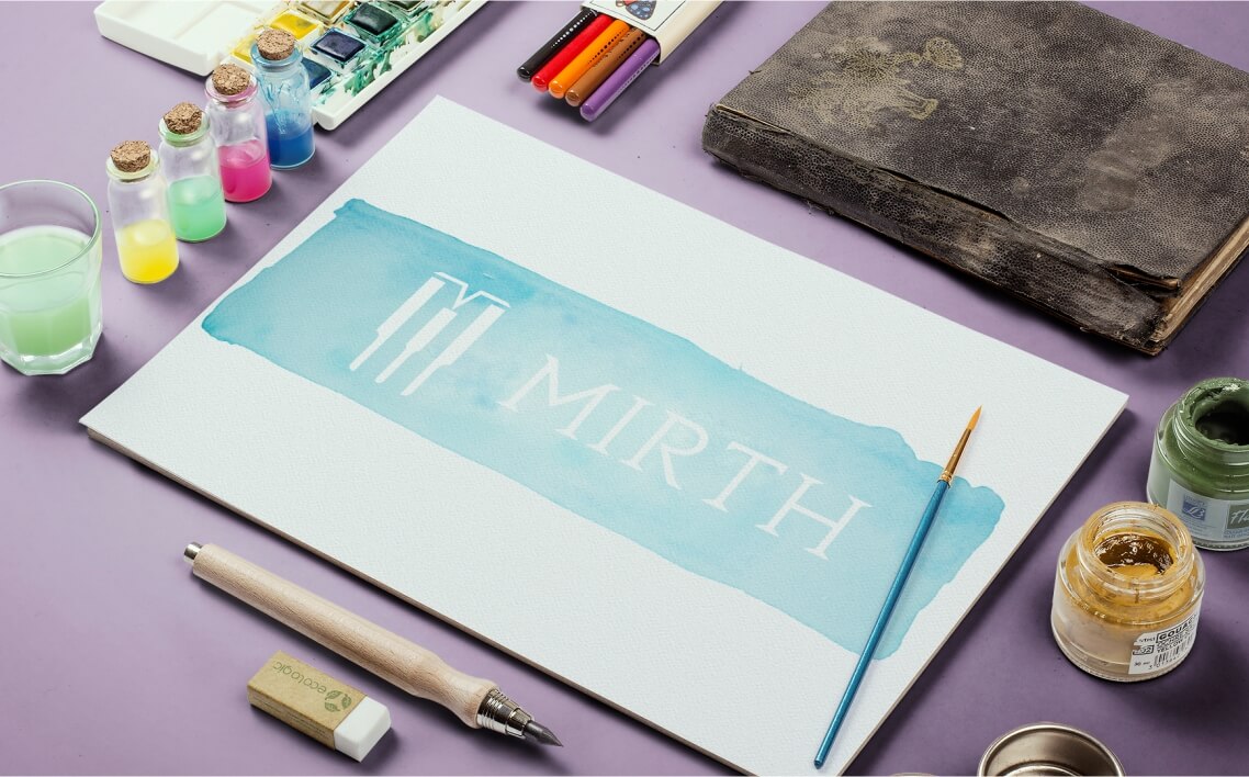

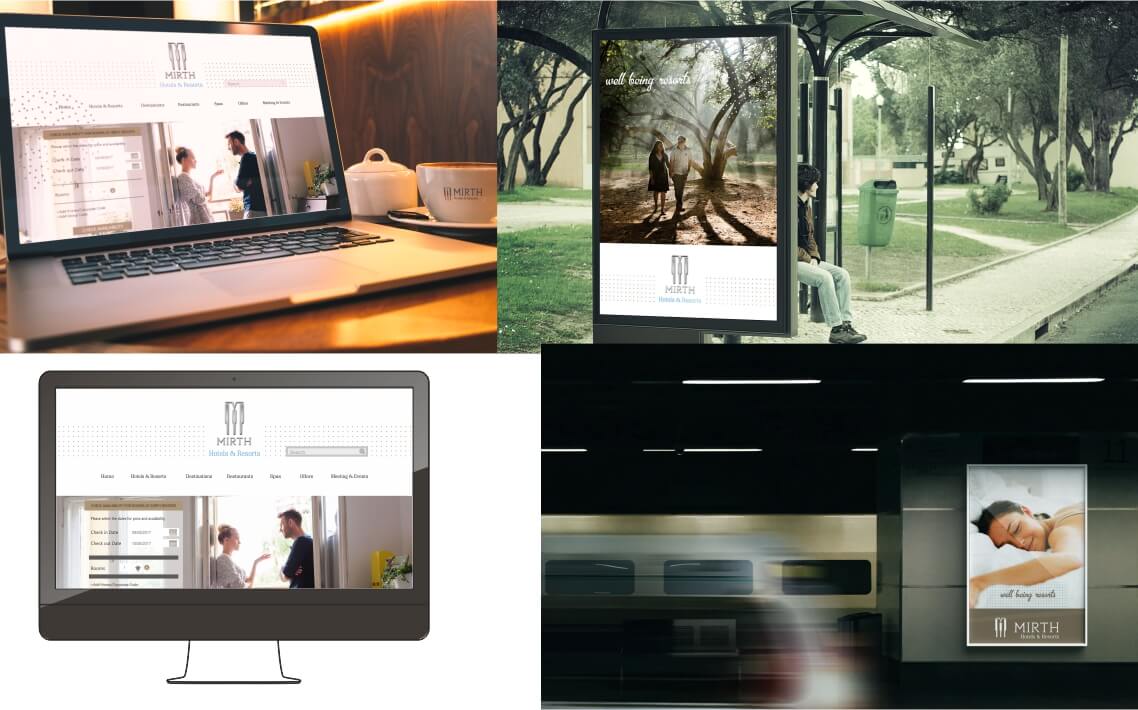
Symbol and Logo.
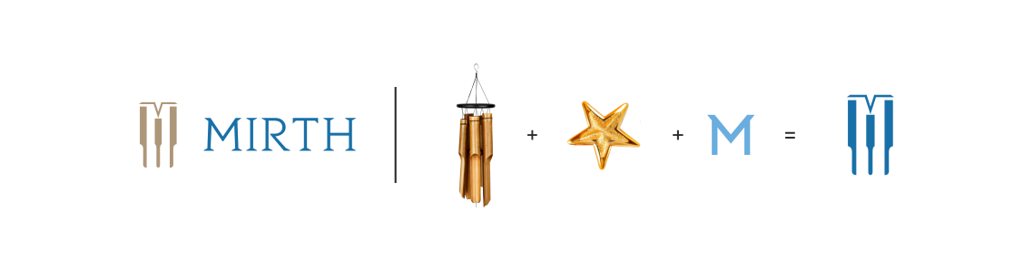
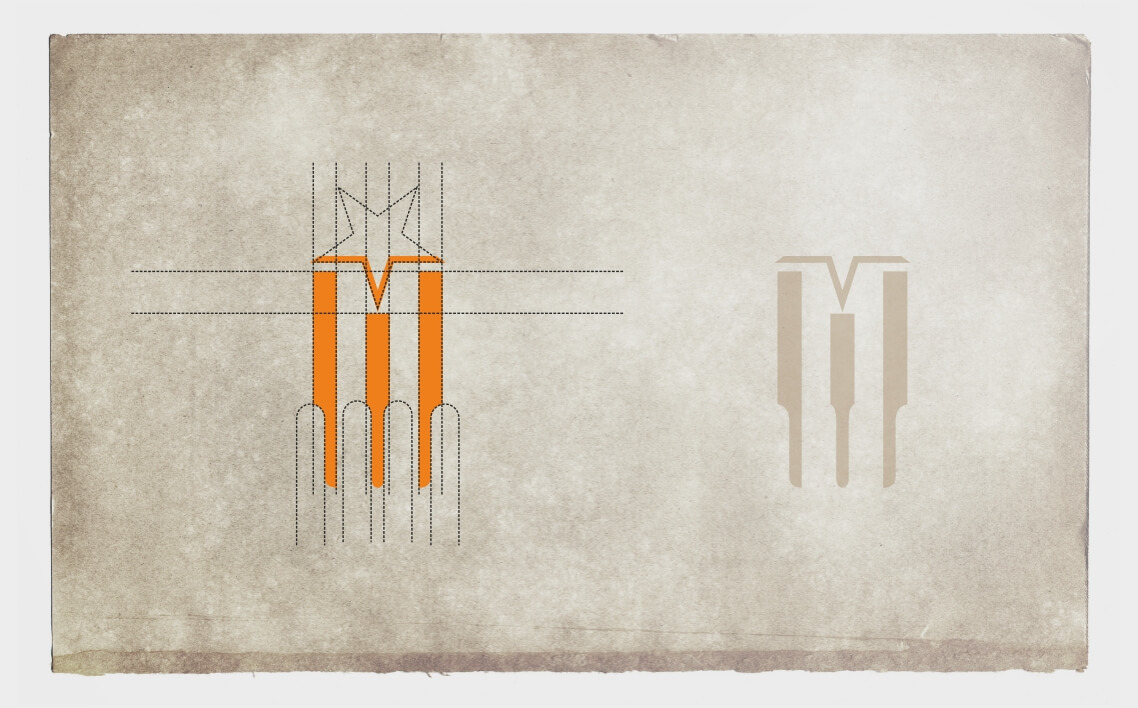
The challenge of WOC Branding was to embrace in a single symbol a cultural and spiritual representation, but without departing from a modern concept. And they came up with an idea that, why not, might work: 'the flower of life'. A circular geometry in which there are other small circles that create radial patterns that appear to form flowers. A practice that has been used for years to draw from ornamental forms to mystical concepts. Mirth, the eight-pointed star symbolizing a paradise for Indian culture, which already appeared in its previous visual identity, is still present in the new symbol and all the architecture of the premises.
To design the MIRTH logo they have opted for an elegant typography, GOTHAM , which matches the symmetry and sacred geometry of Indian art for its main word: 'MIRTH'. In a second line it reads 'Resorts', this time of smaller size and using a typeface that contrasts with Engravers Gothic. The result is a horizontal, symmetrical and clean logo that conveys the spiritual serenity of the brand experience.
The typography chosen for the rest of MIRTH texts is Segoe UI Light. Its titles, by the way, remember to the Indian calligraphy, with contrasts in some characters but prevailing a geometry between its letters.

The Range of Colors.
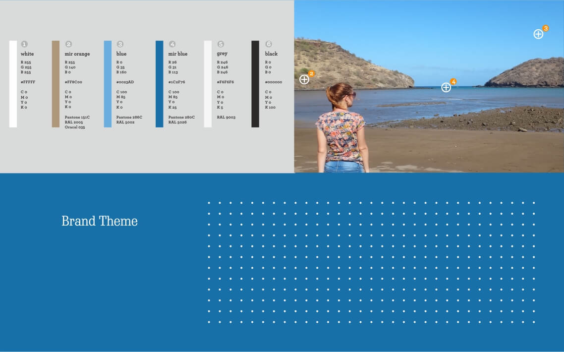
The range of colors used for the design of the brand traditional colors of the Indian Culture. WOC wanted to innovate, to differentiate MIRTH from the rest of competitors. Thorpe olive green, a semiprecious stone from the high range of western ghats , would be the main corporate color. The rest of the color palette ranges from earth tones to stone colors to keep the essence of Indian architecture.

Objective.
The visual identity of the brand did not convey the actual value of the product. We had to exploit the full potential of the unusual experience and service that users receive in Mirth Resorts. To this end, they went to work, and carried out an arduous analysis after which they decided what would be the new digital and verbal communication strategy of the Indian brand, as well as its new visual identity.


Strategy.
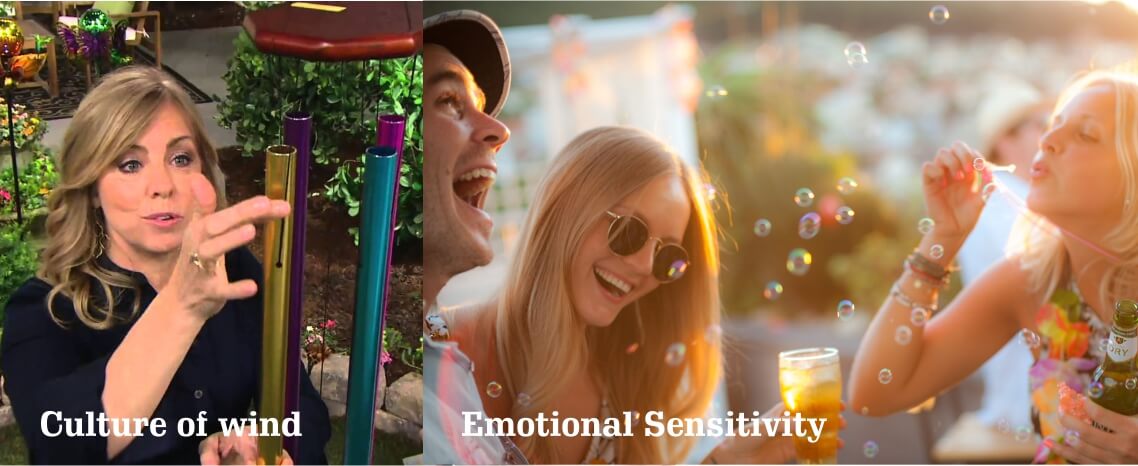
The strategy carried out by WOC for MIRTH Resorts was that the brand was modern, and that in turn offered a subtle reinterpretation of hedonism and the refinement of the Indian culture. Nature and spirituality are two other concepts that had to be clear in their image. After shuffling several options, they gave the identity that responded to MIRTH: 'The culture of wind' would be its new positioning and 'emotional sensitivity' guide by its brand. The chosen images include three concepts: 'culture of wind, body and hospitality', interpreting in a modern way the historical heritage of India..
Similar Projects

Ask for a quote
Do you want to request a quote for the creation of a logo, a visual identity or a graphic design project?